This website has not (yet) been optimised for mobile display. You best experience the model of Rietveld's pressroom on a regular monitor with a resolution of 1920x1080 pixels.

The model is currently loading on the background, which can cause a delayed response of the button.

UNESCO pressroom by Gerrit Thomas Rietveld (1958)

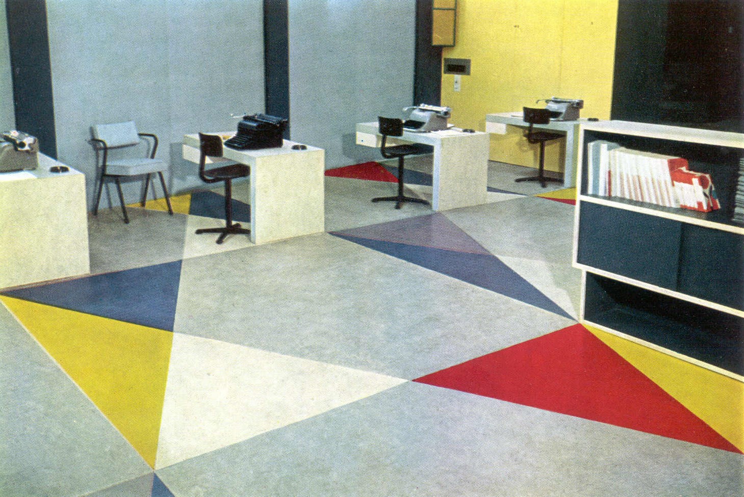
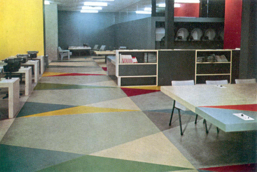
When UNESCO’s headquarters were inaugurated on the 3rd of november 1958, hidden within their concrete walls was an architectural gem: the UNESCO Press Room. This room was designed by the Dutch architect and furniture maker, Gerrit Thomas Rietveld (1888-1964), who was well known because of his membership of ‘De Stijl’ movement. The Dutch Minister of Education, Arts and Science mr. Cals handed the room over as a National gift from the Dutch government to UNESCO. Other member states of UNESCO also gave complete rooms and artworks as National gifts, which gave the building an international character. What made the pressroom so unique was the special combination of colours and lines. Next to that, he used for example linoleum on both the floor and table tops, creating a continuous colourful pattern throughout the entire room. It resulted in an ensemble that was more looking like an artwork than an office.
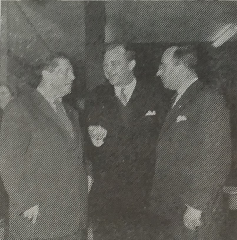
Gerrit Rietveld, General Director of UNESCO Luther Evans en Minister of Education, Arts and Science Jo Cals at the opening on november 3rd, 1958.

Today, only fragments of the Press Room still remind us of this ensemble. In 1982 the complete interior at UNESCO was dismantled. Most of the furniture was brought back to the Cultural Heritage Agency of the Netherlands for safekeeping. The Agency wishes to physically reconstruct the Press Room ensemble again but, unfortunately, a lot of information is missing, the floor was not saved and the only photographs of the room are either black and white or hand coloured. This results in a very one-sided view of the room. A research project was started to investigate various aspects of the room. The research was executed in close collaboration with the Conservation and Restoration department of the University of Amsterdam (UVA). This led to historical research on the colours of the linoleum in the pressroom, on the basis of which this 3D model was developed by the UvA 4D Research Lab. The 3D model is a rendering of the current state of the research and will be further developed in the future.
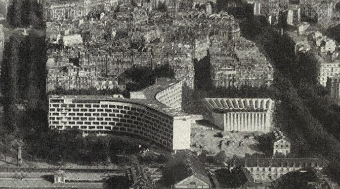
The Unesco Headquarter viewed from the Eiffeltower.

A photo of the room from 1958.

Colofon

This 3D model has been created by Tijm Lanjouw of the 4D Research Lab and Santje Pander of the University of Amsterdam in collaboration with the Cultural Heritage Agency of the Netherlands. Texts were written by Santje Pander and Dorian Meijnen of the Cultural Heritage Agency.

Sources

  • “Unesco gebouw Parijs” in: Linoleumnieuws. 10. 1958: 19.
  • Buffinga, A. (1959) “Het hoofdkwartier van de Unesco te Parijs”, in Bouw, 3-10-1959 Vol. 14 (40), 1130-1140.
  • Rietveld, G. (1957) “ontwerper en materiaal” in Visie: bouwen en wonen, 1957, vol. 5, 20-21.
  • Rietveld. (1958) ‘Met veel genoegen wil ik het mijne zeggen over wat ik zie in de hedendaagse architectuur.’ Lecture Sika. 1958, 10. Archive Rietveld-Schröder. Inv. GR069.
  • “La Salle de Presse de l’Unesco” in Nouvelles de Hollande, 08-11-1958.
  • Archive Nieuwe Instituut (RIET535, RIET536, RIET537 en RIET538).
  • Unesco archives.

Use of this app

Use the buttons at the bottom to go forwards and backwards in the tour through the Pressroom.

You can quit the tour at any moment to navigate freely.

Press one of the numbers to go back to a specific stop in the tour.

The location

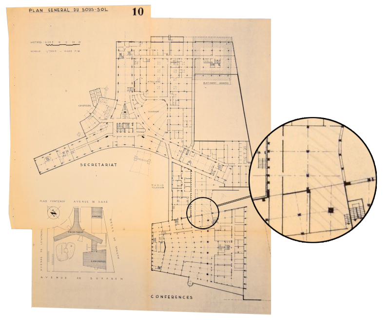
Despite the important commission to build for the UNESCO Headquarters, Rietveld was not entirely happy with the location given to him. The designated location was situated in the basement, very large (12x20,5 m), irregularly shaped and contained several obstructive columns. Rietveld stated: “To make such an interior look like a pleasant workplace, there was, next to a good form and placement of installations, some kind of juggling with colours and lines needed.’ By juggling with colours and lines, Rietveld created a design that was completely adjusted to the location at UNESCO.

The floor design

To bring structure in the Press Room, the floorplan was divided in squares of 241.5 cm2 and subdivided in geometrically shaped planes of linoleum in different colours. He based these measurements on the distance between the columns in the middle of the room he had to work around. He worked his floor pattern starting from the middle, and not from the corners, with the result that the pattern does not always end at a wall.

Unity of floor and furniture

“A space where so many tables are being placed, quickly becomes full and restless if one does not accomplish to make a unity of floor and table covering”. This unity was achieved by executing the floor and tables in the same linoleum pattern. From a practical perspective he chose to use a combination of Marmoleum and solid Walton linoleum from the Linoleum factory at Krommenie. “Multiple times I had covered tables with linoleum in a solid colour. The same finishing would not be suitable for the floor: shoeprints, dust and scratches would make the floor stale very quickly. In my opinion a certain colour combination needs to be made that is calm, but strong enough to cover up the small damages caused by walking”.

Vinyl wallcovering

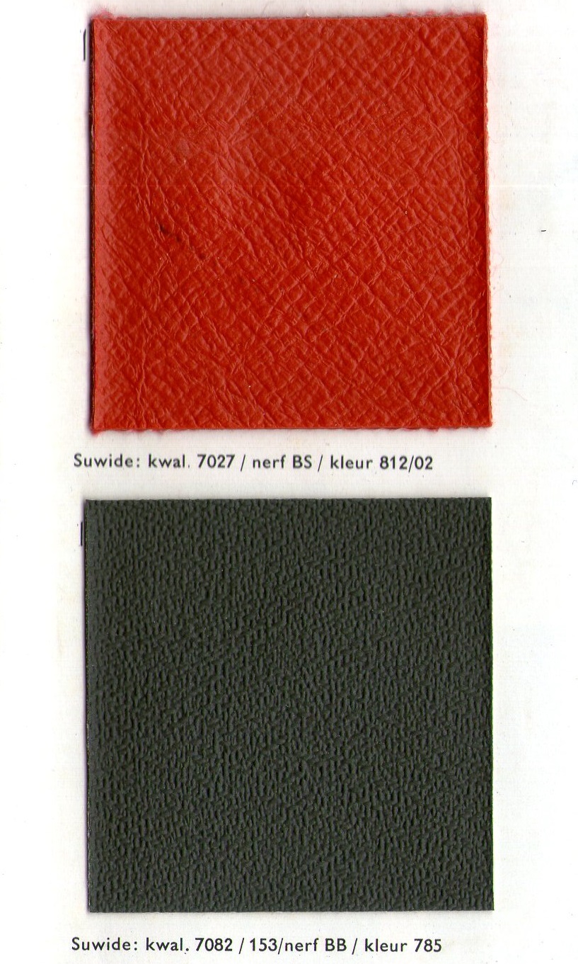
“I immediately thought of plastic, the wonder material, which seems to be suited for everything and is available in fresh colours” wrote Rietveld in 1958 about his use of materials in the pressroom. For the floor and tables he had already picked linoleum and wanted the same unity for the walls and chairs. He chose to use Suwide, a vinyl on textile which was available in many colours, structures and strengths. He ordered the suwide at the Helmondse Textiel Maatschappij (HaTeMa). For the chairs he used a light grey Suwide and for the walls he used anthracite, green, dark blue, light grey and red. “I am aware that these two very different functions are mostly asking for very different materials, but to make in this specific case a unity out of multitude I think it was acceptable. Especially because at the moment you cannot wish for a more practical material for both wallcovering and the covering of seats.”

Armchair

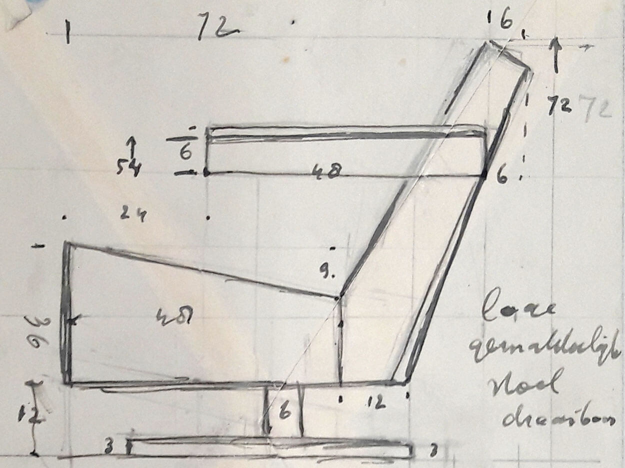
Rietveld designed most of the furniture for the pressroom himself. For the fauteuils he did make a design, which we see here on the image, but in the end he did not use this design. Probably because of financial reasons, he decided to re-use two designs from the Expo 58 in Brussels earlier that year. These chairs were produced by Artifort in Maastricht. One of these chairs goes by the nickname ‘The Swan’.

Problems with the placement of furniture

Rietveld was not very happy with how his furniture was handled. Rietveld sent the furniture to Paris already in April, but once there they were put into storage in a cellar and used as seats during lunchtime for all the workmen. If they had put the furniture in the room on time, another problem would have been prevented too. The conference table was too large to get into the room when they started to furnish the room. Rietveld had to dismantle a window and its frames to allow the table be carried through the window into the pressroom.

Use of the colour green

Rietveld, as a member of the Stijl, is known for his use of primary colours. The use of secondary colours, like green, is typical for Rietveld’s post-war period. The green works as a calm colour in a beautifully balanced colour palette that Rietveld selected.

The furniture and the floor pattern

The pattern on the floor was the base of the design by Rietveld. The dimensions of the furniture were in proportion to the floor pattern. The tables with the typewriters for example were half a floor plane in width and a quarter deep. The large conference table was two floor planes in width and three quarters deep. Every piece was also exactly placed in line with the floor grid.

Side room

From the design drawings in the Rietveld archives it appeared that Rietveld also designed the office next to the pressroom. In this office the Association of foreign press in Paris was seated and because this office was only accessible through the pressroom it made sense that Rietveld would make a design for this room too. Because he got the assignment just a few months before the opening, he decided not to design new furniture for this room of 4,5m x 4,5m. Instead he ordered furniture from the catalogue of Ahrend De Cirkel. The linoleum pattern was continued from the pressroom into this office.

Recesses

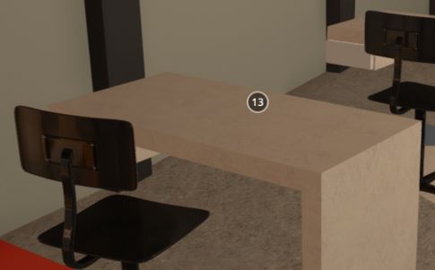
Interesting details in the design are the cut-outs at the foot of this desk. Even though nothing can be found about it in the documentation, the making of the 3D-model revealed a possible solution. When placing the red wall, it showed that it stands on the floor panel of the second desk, which pushes both the desks a decimetre to the front. Because Rietveld did not want to let go of his strict floorpattern and the placement of the furniture according to this floorpattern, he chose a pragmatic solution and made cut-outs in the desk. In this way he did not have to change the size of the furniture, but still placed it according to the floorpattern.

The stairs

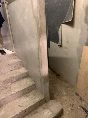
The former Press Room entrance is one of the only remains of the Press Room at the UNESCO Headquarters. Hidden in a small basement passageway it was only recently discovered during this research. At the historic entrance some original wall covering appeared to be still in place. This vinyl covering, which was produced under the name 'Suwide', was applied on both the chairs and walls in the Press Room. This original wall covering forms, together with the chairs, the base of the material technical research on the suwide.

Floor pattern

About the exact placement of the linoleum designs some question marks still remain. Architectural drawings show only the designing phase and not the situation as it was executed. Photo’s appeared to be hand coloured and do not show the true colours as the monochrome green, blue and grey linoleum planes are intermingled on different photographs. However, fragments of the original Press Room floor were recently rediscovered at UNESCO Headquarters. This new discovery can hopefully help to further define the exact placement of the linoleum designs and to further complete the reconstruction of the Press Room.

Mirrors

The irregularly shaped space caused that Rietveld, according his own words ‘had to juggle with lines and colours’. Next to that he used other tricks to enlarge the room and make it feel more rectangular. He placed mirrors on this recessed wall. Through the mirrors, the lights seem to continue and the space looks more regular and optically larger.

The telephone alcove

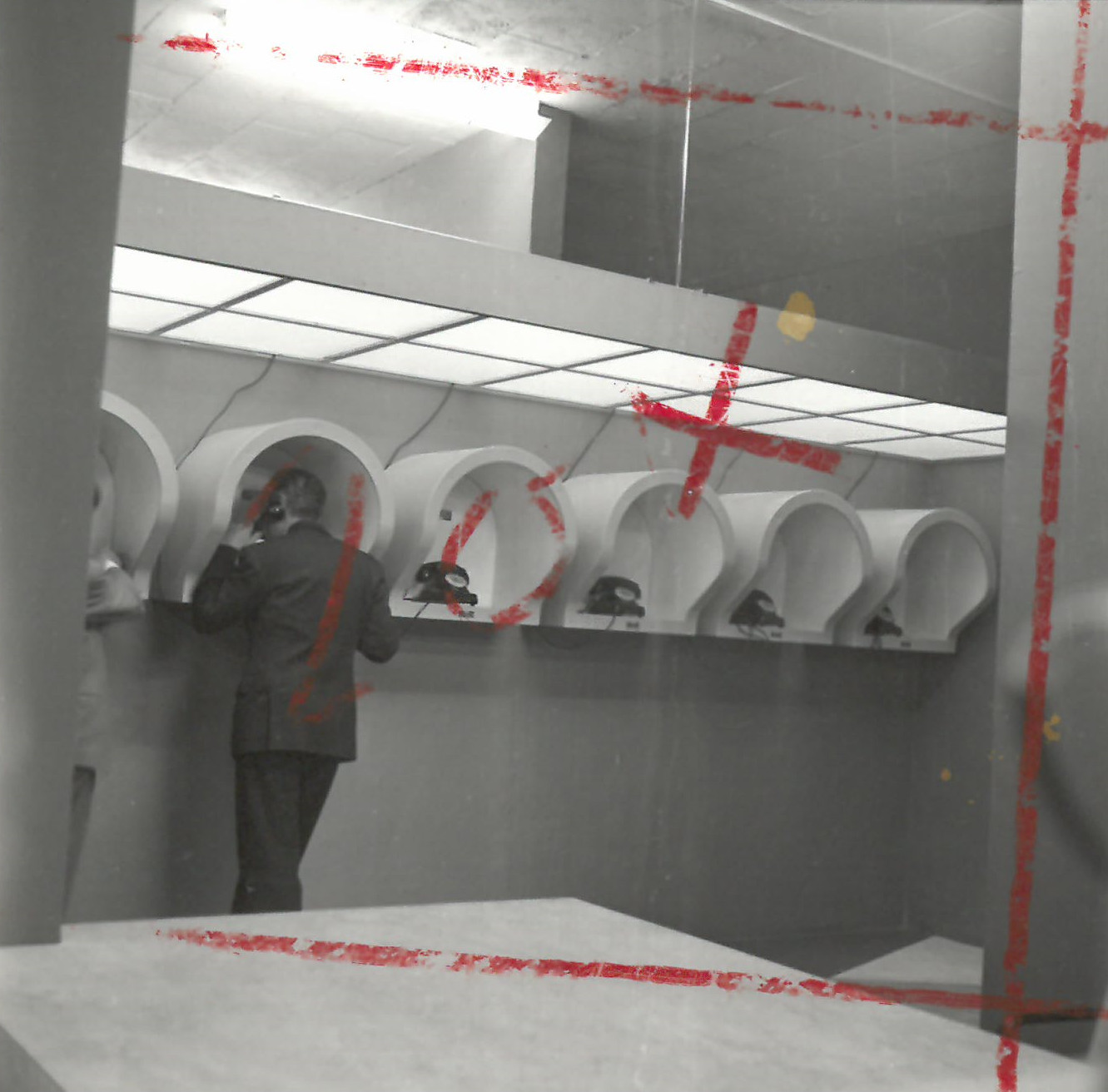
About the execution of the telephones, a lot of discussion took place. Eventually these noise dampening ‘telephone hoods’ were chosen. To lighten up the alcove, Rietveld designed a construction of fluorescent lamps and special glass plates that made the ceiling look illuminated. On this photo, we probably see Rietveld himself at the telephone.

Original colours

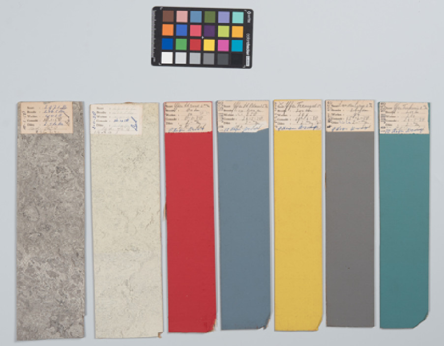
Due to the influence of light the furniture linoleum has slightly degraded over time. However, in the factory archive of the original producer, never used linoleum designs were rediscovered. On architectural drawings by Gerrit Thomas Rietveld numbers were indicated that referred to historic collection books of Linoleum Krommenie (now Forbo Flooring Systems). In the factory archive, that treasures a collection of books of more than 100 years old, the designs were rediscovered. These designs had always been stored in the dark and it is therefore argued that these show a close impression of the bright colours that were used in 1958.

World map table

This world map table was made of a light box with a world map under a glass plate on top of that. Today, only the light box is still existing. The world map has disappeared and from the photos and archives it is not clear what kind of world map was used for this table. An interview with a former employee of the pressroom revealed that this map was regularly changed because of changes in the world boundaries and new members being added to UNESCO. Because they had to change the map so often at the end, they stopped doing it and worked without any map at all!

Use traces

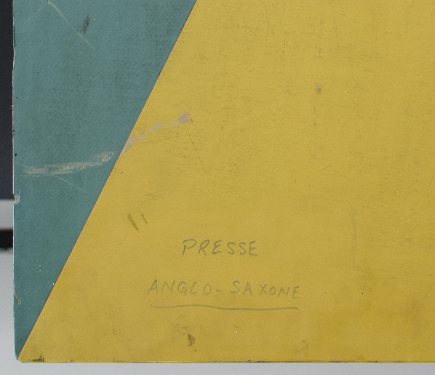
On the tables many traces of usage are visible, for example pencil stripes, burn holes from cigarettes and scuffs. Additional to that, some tables have written texts on them. For example, this table on which the texts ‘Presse Anglo-Saxone’ and ‘Presse Français’ were written on the surface. Following the story of a former employee of the pressroom this was a way to claim a place during busy periods. It was done with erasable pencils and cleaned at the end of the day. Except for the last time!

Conference table

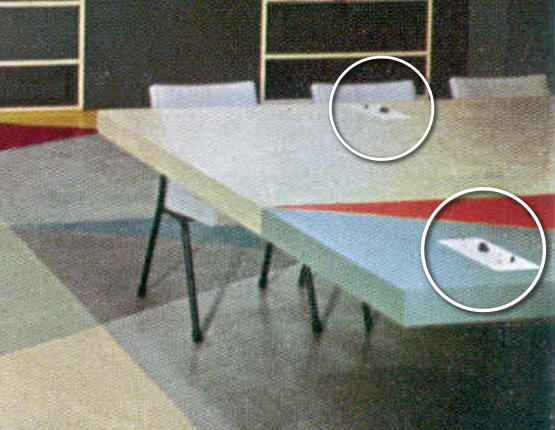
Just a few months before the delivery Rietveld was told that translation devices for foreign press members had to be integrated with the tables. As Rietveld had already send the tables to Paris, this causes quite an inconvenience. One of his employees was send to Paris to create holes in the tables for small white panels with rotary controls. One could connect a headphone, and select the conference which one wished to listen to, and in which language. In the beginning the languages were English, French, Spanish and Arab. Later Chinese (Mandarin) and Russian were added. Fortunately, the tables were hollow, so the wiring could easily be hidden from sight.